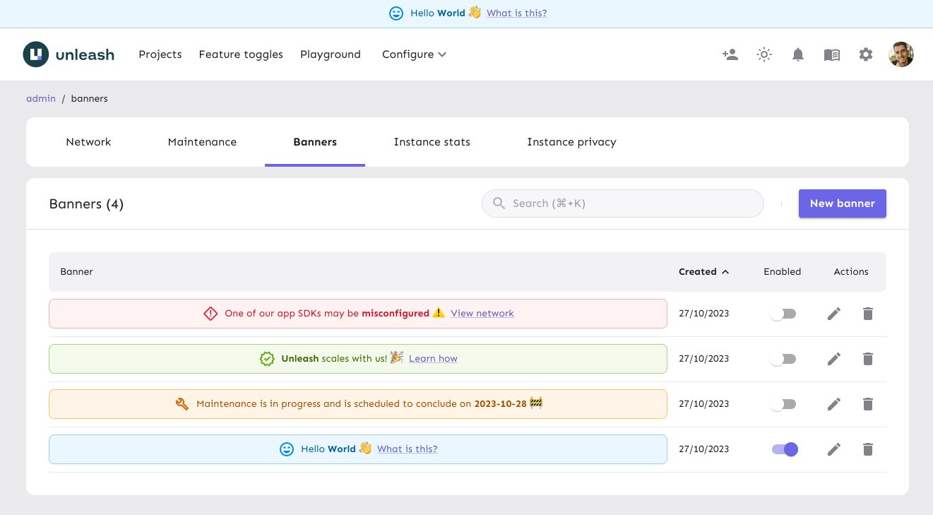
Banners
Banners were introduced in Unleash 5.7 and are only available in Unleash Enterprise.
Banners allow you to configure and display internal messages that all users of your Unleash instance can see and interact with. They are displayed at the top of the Unleash UI, and can be configured to be interactive.

A common use case could be to have some pre-configured banners that you can enable when you need to communicate something to your users. For example, you could have a banner that you enable when you're doing maintenance on your Unleash instance, and another banner that you enable when you're running a survey.
In order to create and display a banner, you can follow the how to create and display banners guide.
Banner status
Banners can be enabled or disabled at any time. For more information on how to enable or disable a banner, see the section on displaying banners.
| Option | Description |
|---|---|
| Enabled | Whether the banner is currently displayed to all users of your Unleash instance. |
Configuration
Banners can be configured with the following options:
| Option | Description |
|---|---|
| Type | The type of banner, which controls the banner's color and its icon, if using the default icon option. |
| Icon | The icon displayed on the banner. This can be the default for the banner type, a custom icon, or hidden by selecting "None". |
| Message | The banner's message. Supports Markdown. |
Custom icon
To further personalize your banner, you can configure it with a custom icon.
To use a custom icon in your banner:
- Select "Custom" in the icon dropdown.
- Enter the name of the desired Material Symbol.
- For example, for the "Rocket Launch" icon, enter
rocket_launchin the custom icon field.
- For example, for the "Rocket Launch" icon, enter
| Option | Description |
|---|---|
| Custom icon | The custom icon to be displayed on the banner, using Material Symbols. |
Banner action
You can set up an action for your banner:
| Option | Description |
|---|---|
| Banner action | The action activated when a user interacts with the banner link. Defaults to "None". Options include a link or a dialog. |
Link
When choosing the link action, a link will be displayed on the banner that directs users to a specified URL.
The configured URL can be absolute, as in e.g. https://docs.getunleash.io/, or relative as in e.g. /admin/network. Absolute URLs will open in a new tab.
| Option | Description |
|---|---|
| URL | The URL to open when the user uses the banner link. |
| Text | The text to display on the banner link. |
Dialog
When opting for a dialog action, an interactable link appears on the banner which opens a dialog with additional information.
| Option | Description |
|---|---|
| Text | The text to display on the banner link. |
| Dialog title | The title to display on the dialog. |
| Dialog content | The content to display on the dialog. Supports Markdown. |
Sticky banner
For added visibility, banners can be configured to be "sticky," ensuring they remain at the top of the Unleash UI, even after scrolling the page. This is useful for banners that you want to make sure that your users see and interact with.
| Option | Description |
|---|---|
| Sticky | Whether the banner is sticky on the screen when scrolling. |